Website Designs
InResONEnce Branding
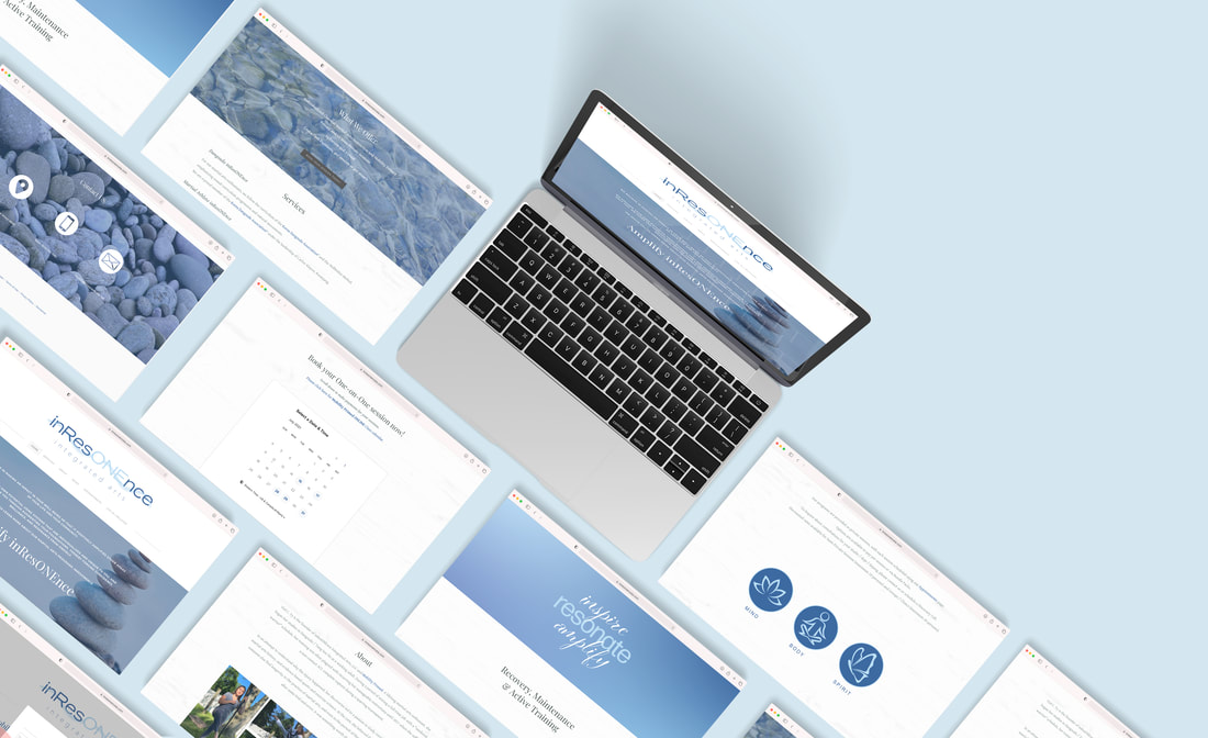
I worked one on one with this client to create a brand identity from the ground up. InresONEnce Integrated Arts was a new business, and we needed to create everything, from the logo to the website and all its components.
One of my favorite things to do is create a brand from top to bottom. There is a lot of freedom and experimentation that goes along with that, and I find the process beautiful. For this particular project I started researching anything and everything I could. My client had no information to give me, other than what her new business venture was trying to accomplish. A mixture of martial arts and physical therapy rolled into a one personalized program.
Like any project, I started digging through massive amounts of research looking for inspiration and direction. Nature and balance plays a large part in martial arts, which is where I found our theme. I fell in love with the idea of using rock stacks by riversides. The pebbles are sturdy, yet smooth to the touch, finding strength in balance. The same river that beat away at them year after year, did not break them. It same them round and able to work with others. That felt very real to me. Life is about working with the tide that washes over you daily. Sometimes it's easy and sometimes it beats the daylight out of you, but after each lesson and personal experience, you have that much more knowledge and power under your belt for the next time.
My imagery was set. Using river rocks and water left me with few color schemes. I could go one of two routes. Using green as my main color felt too forced. Yes, green is considered the color of nature, rebirth, and growth, but it felt too organic. I felt that the color green was too free flowing for my idea of playing with balance and harmony. The aesthetic that I settled on were blue tones paired with white.
In nature the highest point on the planet is the sky. A pure shade of pale blue accompanied by cotton white clouds everywhere you look. Our vast oceans house the lowest part of the earth. A dark shade of blue covers most of our planet. Merging the two together, I created the color scheme that you see above.
The logo was the hardest part of all the content creation. My client wanted to keep flexibility and motion rehabilitation in mind, while also bringing focus to the "ONE" in Inresonence. The proper spelling is "in resonance", but the purpose of her business is to create one-on-one and personalized rehabilitation programs. With that in mind, I went to work sketching and digitally drafting different logo compilations. After sending approximately fifty to my client, she asked for a combination of three different logo ideas. You can see the end result in the image above.
Finally, I created website and social media posts/templates for my client to use once I leave. I gave her a style guide with all of the images, color codes, typefaces, etc.
The website has a white driftwood texture in the background instead of a solid color. It's a small detail that made a big difference overall. I created the icons, images, and did all of the photo editing. Breaking down each page and the content it housed was a breeze. I know how people navigate through websites, and having an easy navigation system is crucial.
In the end my client was thrilled with what I came up with. She had no idea what she wanted at the beginning, but in the end she couldn't picture it any other way.
For a closer look, visit https://www.inresonenceia.com or click the photo above.
Mobility Primed (Pivot)
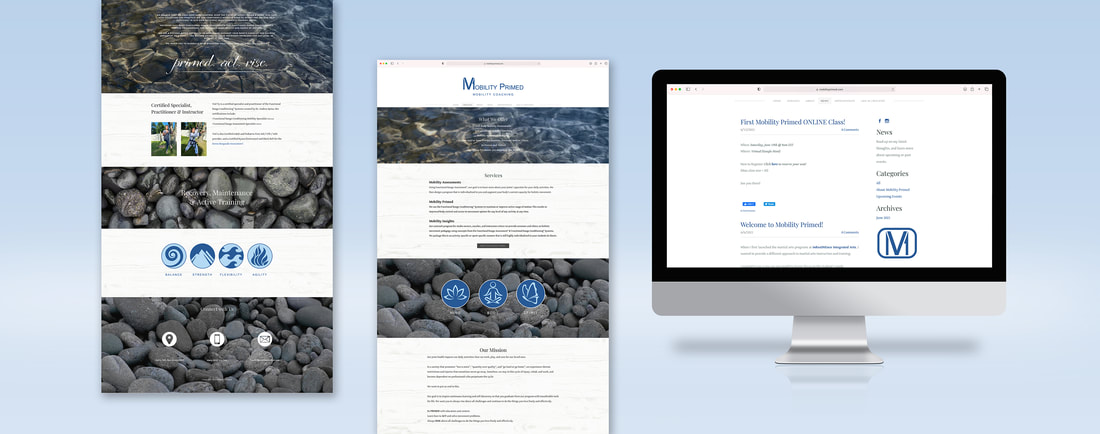
When creating a new business, more often than not, a "pivot" is needed to restructure the original business plan. This same client wanted to focus less on the martial arts part of the business and more so on the rehabilitation.
Starting with changing the name and creating a logo that could be applied in many ways was step number one, Inresonence Integrated Arts was now Mobility Primed. My client liked the idea of using "MV1" in the logo, therefore I placed it inside of the "M" in mobility. Because I made that decision, the logo can be used in full or with just the symbol.
Stepping forward to creating a new website, my client liked original aesthetic, but I felt it was important to let the imagery feel more natural. I took off their blue filters and nearly duplicated the already existing website.
With the Mind, Body and Spirit icons in mind, I wanted to created a second icon image that spoke towards the steps when rehabbing an injury: Balance, Strength, Flexibility and Agility. It helped to tie in the natural theme by using the four elements, while maintaining true to mobility coaching through symbolism.
For a closer look, visit https://www.mobilityprimed.com or click the photo above.
Logo Designs
C. DiGiacomo CPA Logo Design
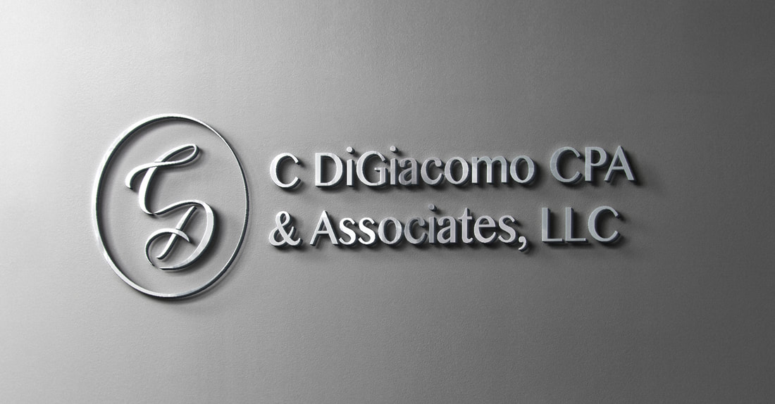
The owner of an accounting company approached me to create a new logo for him after his partner retired and the name of company changed. He wanted a logo that was clean and precise, piggy backing off of the idea of mathematics.
At first he and his team only wanted the name written out in a serif font. I submitted designs based on that request, as well as a few of my own that I felt would work better. My vision was something more modern while maintaining classic minimalism. While combing through hundreds of typefaces, I finally found the perfect one. It encapsulated the idea of a traditional serif typeface, while resembling a modern sans serif one.
Instead of simply finding a typeface and writing out the new company name, I made the decision that a symbol was needed to tie the new branding together. The end result, is the letters C and D intertwined together within a circular frame. I was inspired by the owner's digital signature placed at the bottom of all emails and company letters. I loved the idea of using the base of his initials crossed with a decorative script typeface to bring a personal touch to the otherwise cold logo. The symbol can also be used on its own as a seal for the company.
In the end, my client was extremely pleased with what I had been commissioned to design. They loved that I went beyond what was asked of me in order to create something that they didn't realize they wanted.
The Housewife's Syndrome Logo Design & Title Sequence Images
This project was hands down one of my favorite commissioned works I've ever done. I was able to work directly with the Writer/Director, Emily, and the producer, John. Upon being hired, I was able to preview a near final cut of the short film and was immediately hooked. I began work right away and my brain never stopped turning. Part of the fun and excitement was doing my visual research, pouring through old catalogs and posters, finding everything I could on the classic American Nuclear family.
For the logo, I had complete creative control. I researched typography of the 1950s, (the time period in which the movie is based) and started mixing and matching different typefaces and playing with layout. After a total of nearly 100 alternate logos, the final was chosen and the same fonts would be used in the title sequence images.
This was one of those jobs where they were uncertain exactly what they wanted for the title sequences, but had two ideas. I felt both ideas lacked imagination and failed to capture the essence of what the film was. When I delivered my first round of preliminaries, I included my own idea. The idea of recreating catalog illustrations in a modern way, to match the inclusion of modern technology in the film. The content would remain the same as those from the past, dutiful housewife's and their stereotypical content. The digitization of the illustrations would be my mark on the classic look in the twenty-first century. The paper-like texture in each image kept it just enough of the catalog feeling, needed to connect the dots from my original inspiration.
The feedback on my idea was tenfold what I thought it would be. Both creative minds I was hired by were fully supportive of my idea and decided it was by far the best option. I was given creative control yet again to create the rest of the sequencing images.
The final step was cutting down the color scheme and arranging the images in a way that was pleasant and made sense. Some of the original designs had a mauve green, and some of the background colors were pink and light blue. I had made the decision that less is more when it came to color. I looked back at my research and realized the two main colors you see over and over again were the tan, navy and muted red. Because of this, I chose to make those the three main colors, with each having its own supporting role (light blue, pink and yellow). Above are the end results, placed in sequential order.
Home Town Sandwiches Logo Design
|
|
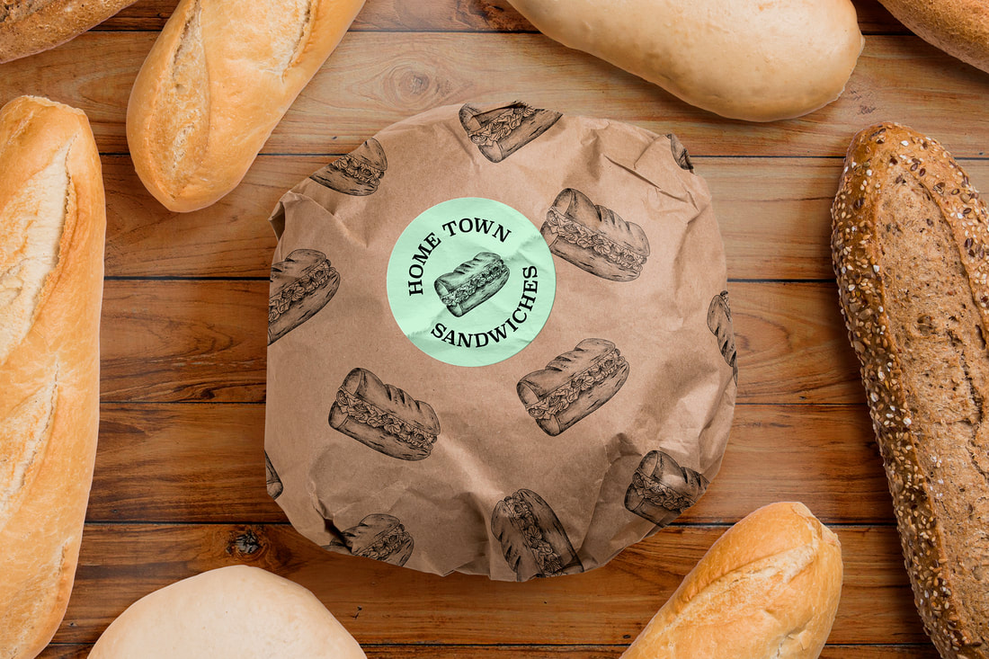
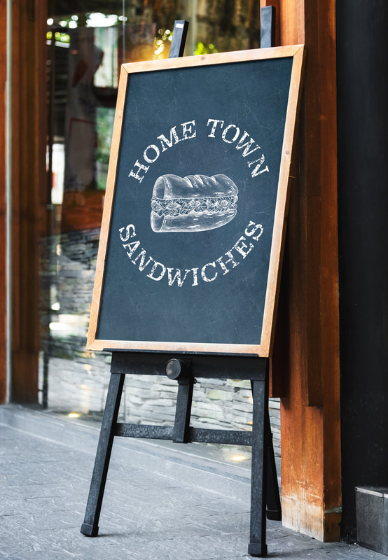
A client approached me with an idea already in hand of what they wanted as a logo for their local sandwich shop, Hometown Sandwiches. I was sent a quick sketch of the general idea: A serif typeface written in a circle with a hoagie in the center. After further discussing their vision, I realized that they wanted a hand drawn graphite textured logo, that could be used in many different formats.
I immediately realized the sandwich would have to be digitally drawn, with no background in order to achieve my client's vision. I used procreate to draw the logo with a granite brush to create an authentic texture. After I drew the sandwich I searched for a typeface that not only matched the original sketch my client gave me, but one that would also match the drawing as well.
In the last round of proofs I sent over, I was able to narrow down the best six typefaces for my client to choose from. Each were unique in their own special way, while maintaining her original vision. In the end, we both decided on a final logo together that we felt looked best.
From company t-shirts and business cards, to stickers, wood carvings, and chalk transfers, the final logo is diverse enough to be used in many different formats, yet easy to be plugged in anywhere.
Print Work
Invitation & Announcement Design
|
|
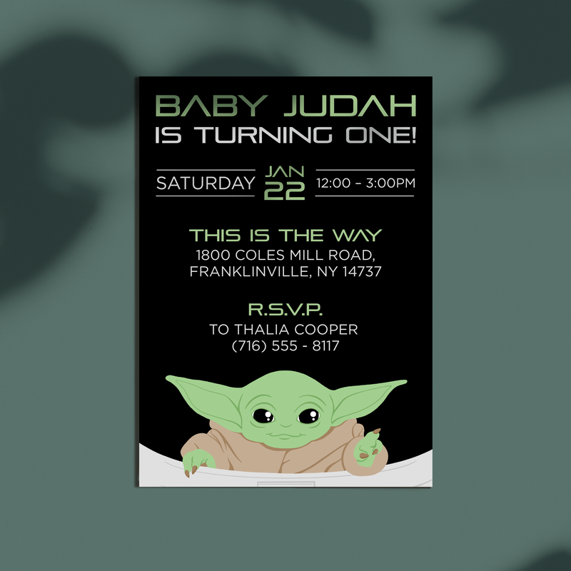
|
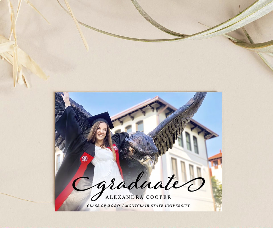
|
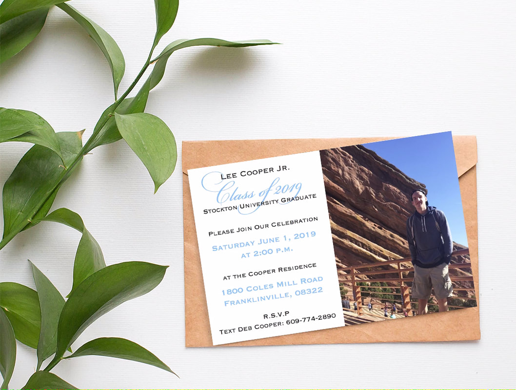
|
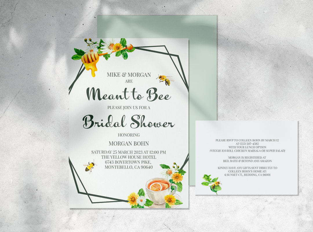
Bridal Shower Design
|
|
|
|
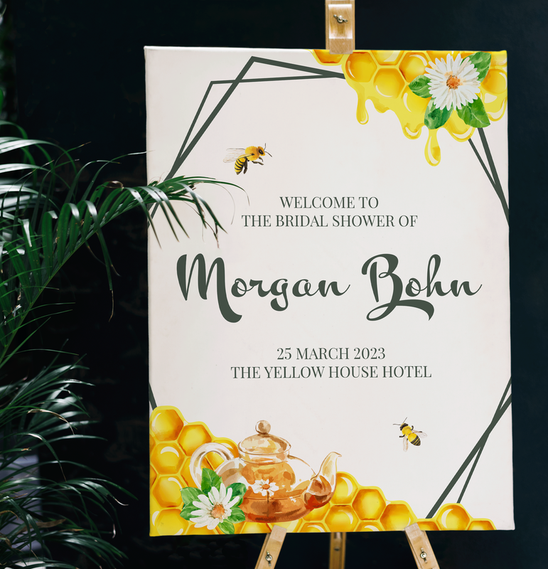
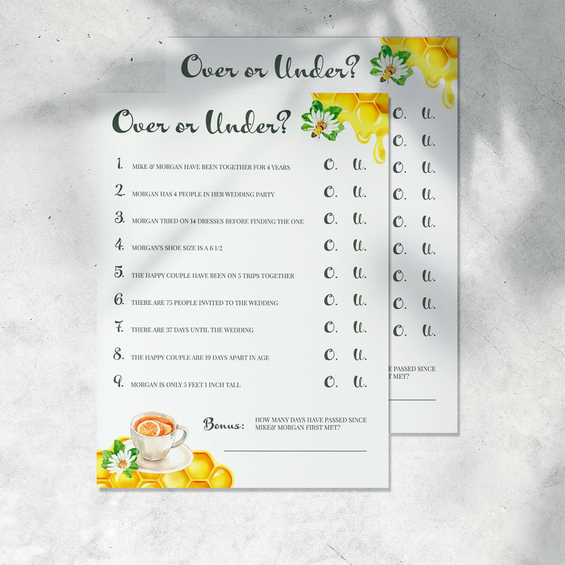
For this Bee & Tea Party themed bridal shower, I wanted to design something bright and fun, while having a touch of elegance.
I started with the invitation and response card. I needed a way to cross the two themes while framing the event details nicely. I knew I wanted to focus on the idea of spring. Tea parties being held in the garden while the bees buzzed around pollinating flowers. The calligraphic font used across designed matched the the inspiration of old times while bringing a crisp modern edge to it. It's easy to read and beautiful to look at. The serif typeface chosen, also had a sophisticated manner. I needed a font that held its integrity when in all caps, and I believe it does so quite well.
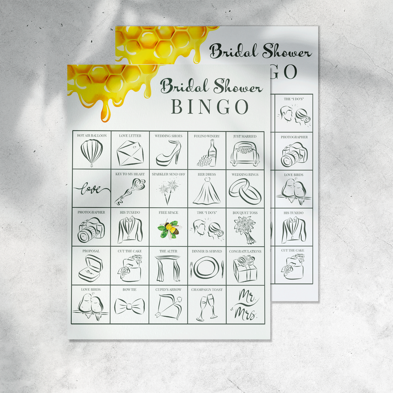
The imagery on the welcome sign and on the games is different than that of the invitation. I wanted to incorporate honey into the designs, being as honey goes well in tea, and the parting gifts for the guests will be jars of honey. It was a nice solution to the design when the teacup or kettle could not fit. I kept some flower detailing and continued to incorporate the bees throughout the collection.
The icons on the bingo cards are custom designed and hand drawn by me. Since the bride will not be opening gifts, it was necessary for me to come up with a fun alternative to the traditional bridal shower activity.
I started with the invitation and response card. I needed a way to cross the two themes while framing the event details nicely. I knew I wanted to focus on the idea of spring. Tea parties being held in the garden while the bees buzzed around pollinating flowers. The calligraphic font used across designed matched the the inspiration of old times while bringing a crisp modern edge to it. It's easy to read and beautiful to look at. The serif typeface chosen, also had a sophisticated manner. I needed a font that held its integrity when in all caps, and I believe it does so quite well.
The imagery on the welcome sign and on the games is different than that of the invitation. I wanted to incorporate honey into the designs, being as honey goes well in tea, and the parting gifts for the guests will be jars of honey. It was a nice solution to the design when the teacup or kettle could not fit. I kept some flower detailing and continued to incorporate the bees throughout the collection.
The icons on the bingo cards are custom designed and hand drawn by me. Since the bride will not be opening gifts, it was necessary for me to come up with a fun alternative to the traditional bridal shower activity.
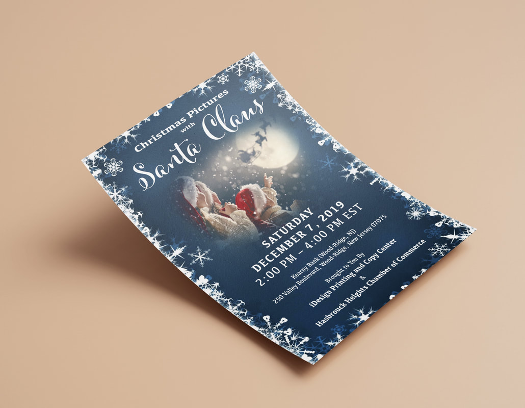
Township Flyer Design